Template (Chosen concept board for Architectonic)
This actually took a while to get everything in the right place and all the picutres lined up perfectly. The intial version of the template board had a different border, but the resolution of the picture was too poor and the board ended up looking a bit too crowded. So I decided to keep it clean and framed the pictures with a simple black border. Also, the font for AQUA took a while to find but it was definitely worth the time as it fits the whole concept quite nicely.
This board was chosen because it has the most pictures and it clearly shows what AQUA is about. It incorporates micro and macro elements with multiple shots at different angles of the building's undulating structure as well as a long shot showing the building as a whole.
Collage
Ok honestly, I was quite stumped for ideas with the collage and it was the last board I did. Lea said the masking tape was a bit cheesy and I'd have to agree but at the time I just couldn't get away from the whole polaroids + tape thing because that's what comes to mind when someone says collage!! I used the warp tool and 4 different close-ups of the building to create the background and just selected the best pictures which showed as many perspectives of the building as possible.

Creative
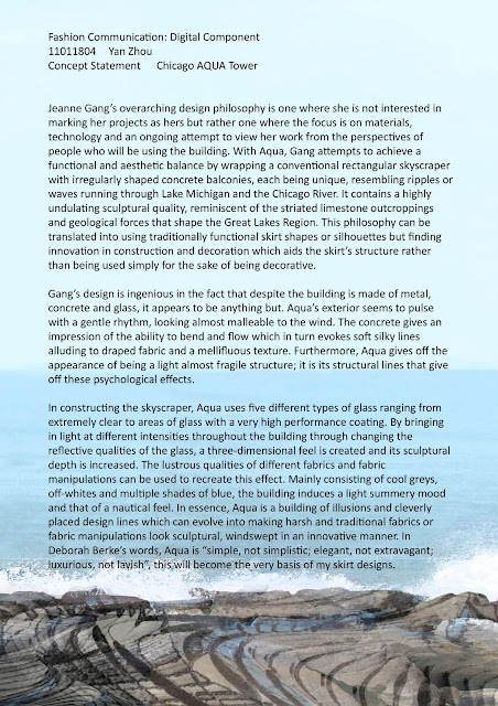
One of Jeanne Gang's many inspirations was the striated limestone outcroppings of the Great Lakes Region and Chicago Lake so I wanted to re-evoke that by making the building actually seem like a giant rock storming out of the vast ocean. I found a suitable background picture of the ocean, then found another with rocks and seafoam. Using the blend/clone/layer mask tools, I got rid of any stray rocks and the clouds because they were too annoying to deal with. Then I used the pen tool and a layer mask to crop the building; I also blurred some of the edges to create a hazy feel. I tried a few different filters on the building and ended up choosing fresco which I also used for the warped building over the rocks. Using two different close-up shots of the building's texture, I warped them over the rocks and played with the opacity levels so that I would achieve a multi-layered result. I also used a layer mask over the warped building to reveal the seafoam in less harsh manner.
Things I Learnt About Photoshop and Assessment 1:
- Always leave enough time to do draft prints. My initial template board did not turn out well. The border was grainy due to low resolution and not all of the images used were clean cut. Zoom in at every point before printing to make sure everything is right.
- Starting with a background image is a good idea as it creates a base for your presentation and a starting point. After this step, it is easier to play around with ther images and photoshop tools as you have a better idea of how it will fit in with the base.
- You should always keep each object on its own layer till the very end before merging anything in case you want to change an individual aspect of an already merged layer.
- Only rastorize shapes and text when you are absolutely sure that is how you want it to be. I had to re-do text many times and it unnecessarily took up alot of time.
- Using a thicker paper e.g. 200gsm really helps with mounting; because of its thickness, the paper falls nicely onto the board without air bubbles or bumps.